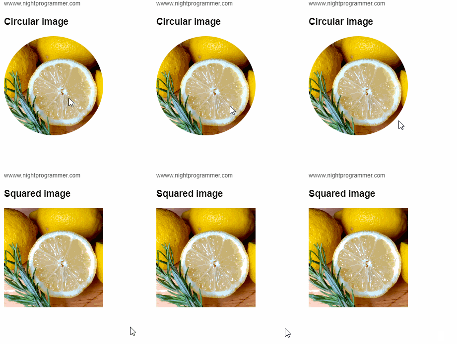
In the previous article, I’ve shown how you can enlarge an image on mouse hover. In this article, you’ll learn how you can make an image circular (circular border radius) in Vue.js. The idea is to have a class attached to the image with a square radius by default. However, whenever you hover (mouseover) over the image, you update a state which will set the hovered property to true. You can then bind this hovered property (state) to the CSS class dynamically which has a border-radius of 50%. The border radius of 50% with a smooth transition of 0.2 seconds will result in the following view:

Here I’ve written code to demonstrate the same:
<template>
  <div id="app">
    <div class="np-credits">wwww.nightprogrammer.com</div>
    <div>
      <h3>{{ imageHovered ? "Circular" : "Squared" }} image</h3>
      <img
        :src="$options.imgSource"
        :class="{
          'img-size': true,
          'img-square': true,
          'img-circular': imageHovered,
        }"
        @mouseover="makeImageCircular"
        @mouseout="makeImageRectangular"
      />
    </div>
  </div>
</template>

<script>
export default {
  name: "App",
  created() {
    this.$options.imgSource =
      "https://images.unsplash.com/photo-1597589022928-bb4002c099ec";
  },
  data() {
    return {
      imageHovered: false,
    };
  },
  methods: {
    makeImageCircular() {
      this.imageHovered = true;
    },
    makeImageRectangular() {
      this.imageHovered = false;
    },
  },
};
</script>

<style>
#app {
  font-family: "Avenir", Helvetica, Arial, sans-serif;
  -webkit-font-smoothing: antialiased;
  -moz-osx-font-smoothing: grayscale;
  padding: 24px;
}

.img-size {
  height: 200px;
}

.img-square {
  border-radius: 0;
  transition: all 0.2s;
}

.img-circular {
  border-radius: 50%;
  transition: all 0.2s;
}

.np-credits {
  font-size: 12px;
  margin-bottom: 12px;
  color: #4b4b4b;
}
</style>
Code language: HTML, XML (xml)
You can find a working example of the above code from my repo links below:
