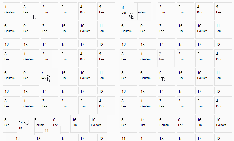
We can easily create a draggagle container / calendar grid in Vue.js, thanks to vue-js-grid. To start building the grid, you’d first need to install the npm package. To do that, fire up your terminal and run the following commands:
npm install vue-js-gridOnce the package is installed, we now need to register it globally so that we can use it in our components. Here’s our main.js file:
import Vue from "vue";
import App from "./App.vue";
import Grid from "vue-js-grid";

Vue.config.productionTip = false;
Vue.use(Grid);

new Vue({
  render: (h) => h(App)
}).$mount("#app");

Code language: JavaScript (javascript)
We can now create our basic grid cell component where we’d be passing the cell data. Let’s consider we have a list of objects with the following pattern:
{
  id: 1,
  title: Gautam
}
Code language: CSS (css)
Here’s our GridItem.vue component file content:
<template>
  <div id="app">
    <div class="grid-item-container">
      <div class="grid-item-id">
        {{ gridItem.id }}
      </div>
      <div class="grid-item-title">
        {{ gridItem.title }}
      </div>
    </div>
  </div>
</template>

<script>
export default {
  name: "Grid",
  props: ["gridItem"],
};
</script>

<style scoped>
.grid-item-container {
  border: 1px solid rgb(224, 224, 224);
  width: 60px;
  height: 60px;
  padding: 6px;
  background: rgb(250, 250, 250);
}

.grid-item-id {
  padding-top: 4px;
}

.grid-item-title {
  padding-top: 6px;
  font-size: 12px;
}
</style>
Code language: HTML, XML (xml)
In the component above, we’re accepting a prop named gridItem which contains an id and a title. We’ve simple bind those those values in the template above.
Now, here’s the App.vue file where we’re generating some data and passing them via the items prop below:
<template>
  <div id="app">
    <h2 style="padding-left: 20px">Vue draggable grid</h2>
    <grid
      :draggable="true"
      :sortable="true"
      :items="gridItems"
      :height="100"
      :width="100"
    >
      <template slot="cell" scope="props">
        <GridItem :grid-item="props.item" />
      </template>
    </grid>
    <div class="np-credits">wwww.nightprogrammer.com</div>
  </div>
</template>

<script>
import GridItem from "./GridItem";

export default {
  name: "App",
  data() {
    return {
      gridItems: Array(40)
        .fill()
        .map((_, i) => this.createItem(i)),
    };
  },
  components: {
    GridItem,
  },
  methods: {
    createItem(index) {
      const names = ["Gautam", "Tom", "Tim", "Kim", "Lee"];

      return {
        id: index + 1,
        title: names[Math.floor(Math.random() * 5)],
      };
    },
  },
};
</script>

<style>
#app {
  font-family: "Avenir", Helvetica, Arial, sans-serif;
  -webkit-font-smoothing: antialiased;
  -moz-osx-font-smoothing: grayscale;
  padding: 24px;
}

.np-credits {
  font-size: 12px;
  margin-top: 40px;
  color: #4b4b4b;
}
</style>
Code language: HTML, XML (xml)
As you can see in the above code in line number 26, we’re creating a list of 40 items with an id and a title each. We’re using the createItem custom method to create such a series of data.
Then on line 7, we’re passing those data to the grid component.
We’ve also passed with following props to the grid component:
- draggable: To toggle whether to make the grid items draggble
- sortable: To make the grid sortable with drag
- items: This is where we pass our grid data
- height: Height of the grid cell in percentage
- width: Height of the grid cell in percentage
You can find a working version of the above code from my repo links below:

