More often than not, we’d need to bind CSS class names conditionally. One of the prime examples is form validation. We often like to highlight to show erroneous messages in red if a form validation fails. We’d otherwise show it in green or not show it at all.
In Svelte, we can easily bind CSS classes based on the truthiness of a condition.
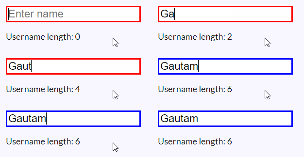
Let’s have a look at an example where we need to enter a username. The border of the input field remains red until we type in at least 4 characters for the name. Once it is validated, that is gets 4 characters, the border becomes blue.
We do this by conditionally binding two CSS classes. We choose the class we want to bind based on the validation condition.
Here’s the code for the example:
<script>
  let userName = ''
  $: userNameLength = userName.length
  $: userNameValid = userNameLength > 4
</script>

<div>
  <input
    type="text"
    bind:value={userName}
    placeholder="Enter name"
    class={userNameValid
      ? 'username username-valid'
      : 'username username-invalid'}
  />
  <p>
    Username length: {userNameLength}
  </p>
</div>

<style>
  .username {
    font-size: 22px;
    outline: none;
  }

  .username-valid {
    border: 3px solid blue;
  }

  .username-invalid {
    border: 3px solid red;
  }
</style>

Code language: HTML, XML (xml)
In the above example, you’d notice that we had to use the username class twice, in both conditions. We can actually add each of the class names based on some condition. We can of course, explicitly define which class names we want in all cases (as we do in normal HTML).
  <input
    type="text"
    bind:value={userName}
    placeholder="Enter name"
    class="username"
    class:username-valid={userNameValid}
    class:username-invalid={!userNameValid}
  />
Code language: HTML, XML (xml)
You’d see that through lines 12-14 in the main example we’re conditionally binding the CSS classes based on the truthiness of userNameValid property. This property depends on another property named userNameLength. userNameLength checks whether or not the input length is greater than 4 characters.
Here’s what the above example looks like in action:


